Educating advertisers about privacy changes
Project overview
When advertisers create ads in Meta Ads Manager, they have various options — from the location of the people they want to target to the types of conversion events they'd like to consider.
However, recent privacy rules and regulations, from iOS 14.5 to the European General Data Protection Regulation (GDPR), have reduced or changed the types of options advertisers can use. For example, these changes may impact ad performance or reduce the size of the audience advertisers can target.
While Meta had existing design and content patterns to inform advertisers of changes, these patterns weren't scalable for the multitude of changes expected from 2020 on. Meta's Ads Manager team was tasked with improving how Meta educates its advertisers and recommends other options.
Key considerations
- Developing understanding of privacy issues. These privacy issues are here to stay: they're a fact of life in the advertising world for 2020 and beyond. It's good for Meta, and good for advertisers, to embrace this change and explain it in as straightforward a way as possible.
- Designing "at a glance" use for on-the-job users. Ads Manager users have very clear jobs to be done and don't like interruption or system changes. Any education had to be easy to skim and not intrusive for the daily user.
- Instilling trust in Meta. In research, users have historically relied on Meta to give them the information they needed. However, privacy changes, and subsequent reductions in performance, have reduced user trust in Meta. Additional education, I hypothesized, would give additional trust to Meta — if implemented correctly.
Status quo
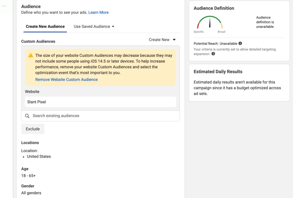 Status quo of Ads Manager before redesign. Note the excessive notice for the Custom Audience on the left, as well as the minimal information afforded on the right-hand side.
In our previous design system for user education, large notices would appear below each feature that was impacted by privacy. These were considered intrusive and hard to understand, with little to guide advertisers beyond the idea that iOS might hurt their audience size.
Even that idea was mired in legalese: weasel words prevented easy understanding, with users often relying on third-party sources to find more information.
Worse: we knew more policies were coming beyond iOS 14. Current design system standards would have asked us to add additional notices below existing cards: an idea clearly designed for a world without so many privacy regulations.
Over the course of 3 months, I worked with one other product designer to define a new design pattern, new content standards for this pattern, and improved approaches to educating Ads Manager users.
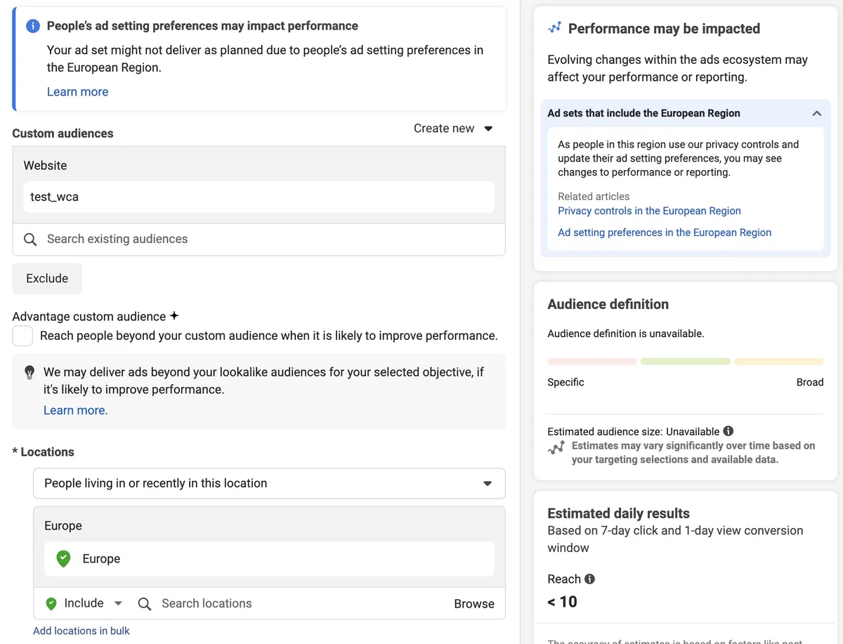 Screenshot of our first approach to improving ads messaging. Note the shorter notices on the left, as well as contextual information on the right-hand side.
A more scalable approach
Initially, I wanted to be conservative with my content approach. After all, advertisers were used to seeing contextual notices, and might even welcome similar design patterns. I hypothesized that keeping the contextual notices, albeit shortened ones, and adding additional context using the white space in the right-hand side, might be a good compromise for the user. Ads leads, famously conservative themselves, approved this thinking.
After shortening various contextual notices, I worked with my product designer to create a new "Performance may be impacted" box for the right-hand side, with a generic opening statement scalable to additional regulations. This was our concession to the omnipresence of privacy issues: that changes were coming, they were constantly evolving, and that ads on Meta would most likely be affected.
My product design partner and I also crafted a collapsible design pattern that could be used for any regulation, starting with the ePrivacy Directive — a new set of laws affecting audiences in Europe. This would show the first three times a user tried to target people in Europe, telling them in specific terms that those people would be able to control how Meta processed their data, and therefore how they could be targeted for ads. For all following times, the box would still appear, but it would be collapsed, indicating our awareness that the user had already seen and (hopefully) understood the issue at hand.
As per my hypothesis, I'd shortened the contextual notices, and given plenty of additional context on the right-hand side. I'd hoped that advertisers would find this a comfortable, yet informative experience. The result? It was pilloried on Twitter.
Simple, straightforward and human
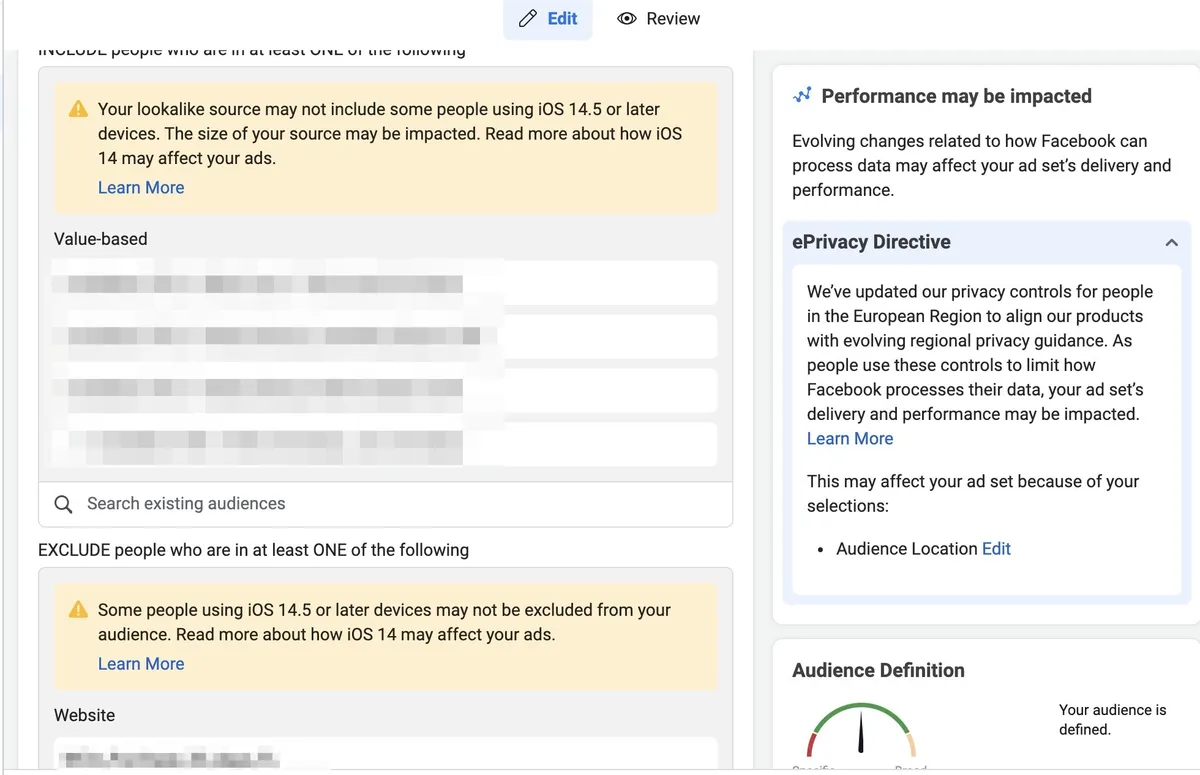 Screenshot of our current approach to messaging. Note the reduction of notices on the left, replaced with upsells of features that could solve delivery issues. Also of note: the condensed messaging in the right-hand rail.
As it turned out, it wasn't the length of the copy that users found objectionable for contextual notices: it was the fact that they existed at all. In research and testing, users consistently found even the improved notices confusing and unactionable; rather than Meta telling them there was a problem, they preferred Meta giving users options to solve problems before they were even aware they existed.
While this was easier said than done, I worked with product managers across the organization to find some solutions that could help users even mildly. Lookalike audience expansion, a feature that allowed users to opt into automatic broadening of their audiences, was one of them. Instead of showing wordy context, we improved our messaging, showing solutions they could use rather than problems they had to solve.
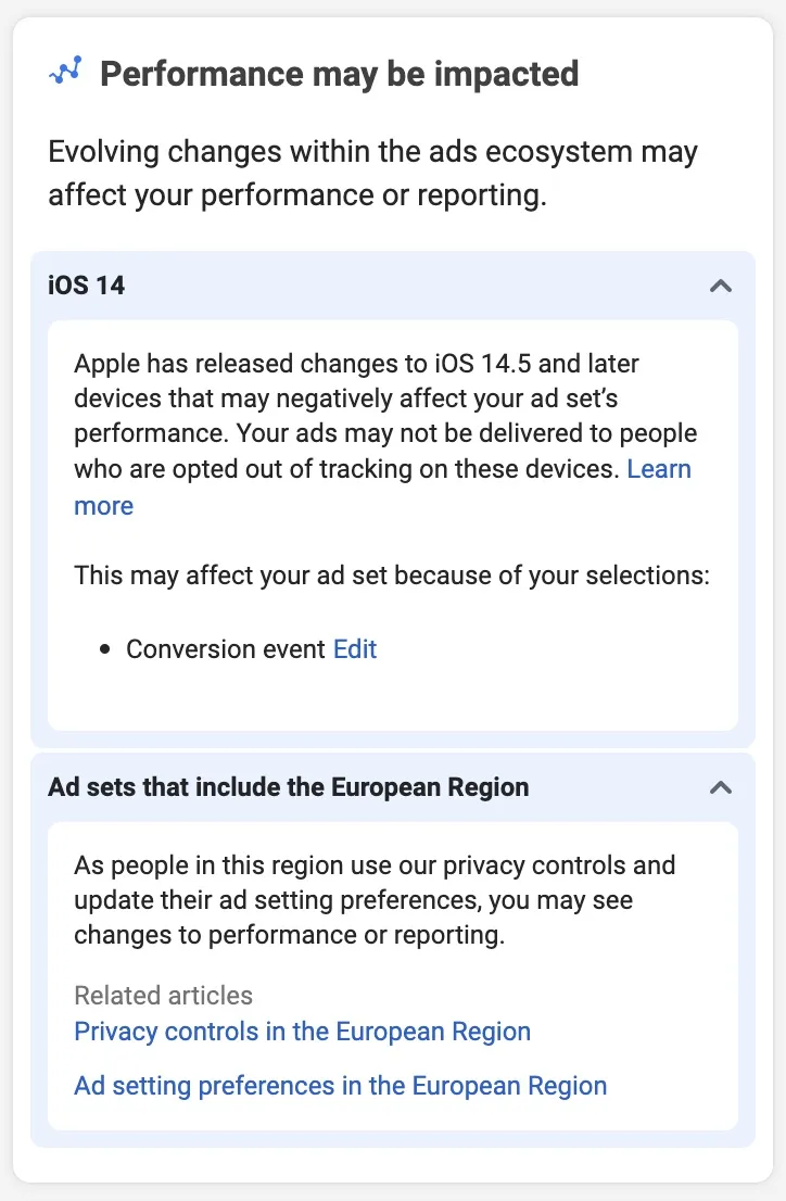 Screenshot of what the right-hand rail looks like with additional privacy notices.
We still retained the context of the problem, of course — only shortened and simplified even further, relegated to the scalable right-hand rail. I added related help articles to the right-hand rail as well when the problem was not likely to be solved by advertisers — such as when the issue at hand was EU-wide legislation.
Finally, I also advocated to keep a broad, audience card-level reminder that these regulations were still in effect. We'd found in research that sometimes users did not look at the right-hand rail; I hypothesized that users would be fine with one, broad notice in the main view, an improvement over the many contextual notices they had tweeted about.
Takeaways
Testing and experimentation continues today, but early results, though confidential, are positive. While ad messaging may not be the most interesting-sounding space outside of ads, I found the project fascinating: a window into how users think about not just ads messaging, but user education writ large. Some key points:
- People read, but they don't always want to. A common refrain among content design naysayers is that "people don't read." The corollary to this, however, is that people don't read poorly formatted or poorly contextualized content. When observing research and rewriting our messaging, we consistently found that people did not read content that was long or confusing — and these were people that constantly read about how to advertise better! What they did read was content that suited the pace of their jobs to be done: short, contextualized (broadly), and with additional resources to spare.
- Your edge cases won't always be edge cases. My predecessors had built ads messaging with the assumption that there would never be too many contextual notices at the same time. However, we noticed during research that it wasn't just privacy changes that were causing so many notices to appear; often, users didn't know how to set up their advertising, and so they saw many notices that they just ignored. Often, we think of edge cases, like "having more than 1 or 2 notices," as truly edge cases. Instead, we ought to do our due diligence with data science and UX research before operating further.
- Complicated topics can be simplified. I think as content designers in ads, we like to say how complicated the ads space is, with the implication that we're allowed to overwrite in order to ensure advertisers understand something. However, this just isn't true (see "People read, but they don't always want to."). Ads content designers and privacy content designers especially ought to consider ways to simplify their content such that people can understand both the legal and performance implications of the issue. After all, Meta Ads Manager is meant to democratize ads among small businesses and enterprise customers; why make ads harder to think about?