Introducing the general public to end-to-end encrypted messaging
In 2022, the Messenger team embarked on an ambitious effort to bring end-to-end encryption (E2EE) to all messages and calls. Whether people used Messenger on their phones, tablets, computers or even Meta Quest devices, their communications would be encrypted: a key security benefit.
As a lead designer on the E2EE effort, I joined 6 other designers to develop a design roadmap, identify privacy and security review needs, and design simple, straightforward and human messaging and components across all E2EE products.
Challenges
Despite E2EE being in the news due to message interceptions, such as in the Russo-Ukrainian War or with people seeking abortion services, people didn’t understand what “encryption” meant, much less “end-to-end encryption.” Early research indicated low understanding and even fear when people saw the phrase. Some even closed their apps when they saw it.
What’s more, it wasn’t guaranteed for technical reasons that we could roll out E2EE across all devices at the same time, meaning some calls and messages would still be unencrypted even after launch. Not only did we have to explain what E2EE was, we had to explain when calls weren’t encrypted. This was especially challenging when people were already confused of what encryption meant in the first place.
Over the year (and beyond), I worked closely with other designers and legal/privacy personnel on different approaches to these problems and more, rapidly iterating as legal/privacy pointed out gaps. I personally wrote UX copy and helped design for several core areas:
- User onboarding and settings: Introducing people to the concept of E2EE and asking them to set up a PIN and other secure features
- High risk joiners: Making sure people understood when people they didn’t know were joining an end-to-end encrypted call
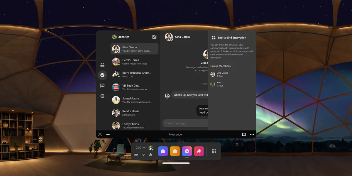
- Desktop and large screen experiences: Adapting mobile-first designs for desktop users without compromising on security cues or usability
- AR/VR experiences: Coordinating with teams working on newer Messenger-capable devices (including Portal and Meta Quest) to design visual cues for E2EE
This particular case study will focus on user onboarding and settings (though if we’re talking in a job interview soon, I’m happy to discuss other topics!).
Approach
This project wasn’t my first encounter with end-to-end encryption. I’d previously used apps like Signal and WhatsApp, but frankly didn’t pay much attention to the details other than being reassured in their own onboarding that messages were “private.” Early research confirmed that this was a common feeling among people.
Thus, there was some reframing in order: and given the multitude of different E2EE projects, it needed to be done quickly, so other teams could align with my initial take on messaging. In fact, my manager told me it needed to be done in just a week, because we already had research participants lined up to test the messaging. No pressure.
First, I worked with my manager to recruit a cross-functional team across design, engineering and security. Then, in lieu of a project manager, I personally planned and executed a two-day sprint with the team, generating ideas across a series of brainstorms, writing sessions and quick mock-ups.
I developed the brainstorms in FigJam, coming to the team with a set of different user stories I thought would make sense to write copy toward, like:
- As a Messenger user concerned about security, I want to know when my calls are E2EE and when they are not.
- As a Messenger user who just wants to message my friends, I want to start messaging as soon as possible, without any disturbances.
- As a Messenger user who is interested in new features, I want to know when new features roll out and how they’re applicable to me.
My team and I assessed these user stories, evaluated if they were relevant (or even accurate), and developed ideas for how we might message to each group. Then, we coalesced further, attempting to develop messaging for all groups, and the touchpoints we might use to surface said messaging.
By the end of the week, with the help of my team’s collective minds, I’d written a slate of security-approved content treatments and design ideas to present to legal, just in time for UX research.
Results of user research
When I took my initial designs to research participants, however, it got mixed results. In particular, the content design was tricky.
One of the content strings I tested referred to non-E2EE calls as using “bank-grade security,” i.e. TLS, not E2EE encryption, whereas E2EE calls were “end-to-end encrypted, so nobody can read this message, including Meta.” But to research participants, these statements felt very similar. In fact, several participants got the wrong impression about “bank-grade security,” thinking that it was higher-security than E2EE!
Another of my designs relied on a full-screen interstitial that would appear before an E2EE call, because I thought that it was important for people to know their call was not E2EE given what people might see about non-E2EE calls in the news. But research participants found this annoying, and often did not even read the details in the interstitial.
Finally, my most unobtrusive design featured a lock on calls and messages that would lock and unlock based on whether the call or message was E2EE or not. This, however, either went completely unnoticed, or deeply worried people who saw an unlocked lock and became worried about their security to the point that they said they would stop using the app.
By the end of the week-long set of moderated user studies, the changes I had to make were clear.
Reframing end-to-end encryption
For me, the key breakthrough was reframing E2EE not as a security feature that warranted a full-screen takeover, but rather as an important feature of everyday life. Prior to this, I had assumed based on news stories about E2EE that E2EE was important enough to pause a job to be done. But it was clear that that was counterproductive to people actually learning more about E2EE.
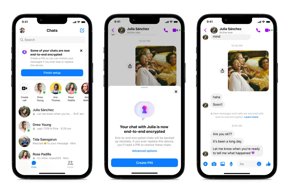
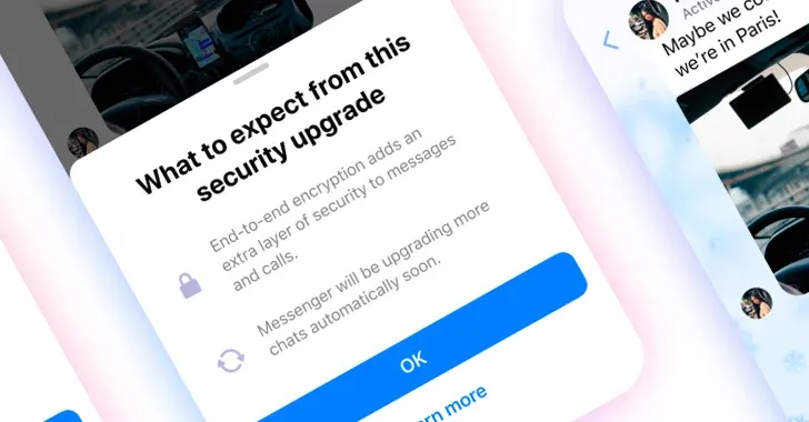
(Yet we did need some messaging. An unlocked and/or locked lock, it turned out, was not the best way to message E2EE.)
Thus, instead of focusing on the security user proposition, I worked with another designer to re-examine our user journey, identifying the best area to onboard a busy user. I significantly reduced messaging complexity as well. Instead of fussing around with terms like “TLS” or “private keys” and so on, I simply explained that E2EE added “an extra layer of security to messages and calls,” and framed it as an “upgrade” that more chats would receive as Meta was technically able. And instead of a full-screen takeover, my fellow designer and I worked on a half-sheet that would appear on chats that were converted to E2EE for the first time, with a “Learn more” button for interested parties.
This, thankfully, performed much better in the next round of research. In fact, despite my concern that people might not want to tap “Learn more,” since they were in the middle of a job to be done, quite a few participants chose to tap it anyway: a clear increase in engagement that was reflected in later product metrics. After additional iteration based on research and design/product reviews, we were ready to ship.
Outcomes & Reflections
Developing the onboarding for E2EE messages and calls challenged me, but also reminded me of why I wanted to be a designer in the first place. Helping guide people into learning about E2EE, and therefore become more security-minded themselves, gratified me, especially with such a knowledge gap to overcome. And distilling E2EE into simple, straightforward and human terms helped massage the discomfort users had about switching entirely to E2EE messaging and calling.
Two takeaways, however, stood out for me:
- Non-designers provide vital feedback to design sprints. So often I’ve worked with designers who insist on keeping brainstorming and ideation to small design groups, only to see backlash and confusion when they bring these designs to broader review. In my design sprint, I deliberately involved non-design cross-functional partners, not just for technical expertise, but to see how they would approach the work. This was especially important given our task was to develop an onboarding for the general public to understand E2EE, not just for designers.
- What you think is your product’s value proposition may not actually be the value proposition. My team and I thought the shift to E2EE was clearly a security benefit, and for our first few revisions, that’s all we designed and wrote for. However, when we entered research, people only talked about how inconvenient we were making it for them to message or call their friends. Of course, this is a classic example of the jobs to be done framework at work. It’s also a classic example of user research being one of the most valuable inputs toward achieving product goals.
Years later, I still think often about our design efforts in bringing E2EE to all of Messenger, and often tell stories from our work when I’m tasked to simplify some complicated task. It’s one of the projects closest to my heart and I’m glad I had the privilege to be a small part of it.